7 Steps to Recreate Apple’s Vision Pro Animation Using Only CSS
Apple’s product pages are famous for their mesmerizing scrolly teardown animations, but they typically rely on JavaScript and often break on smaller screens. With modern CSS scroll-driven animations, we can replicate that magic using nothing but stylesheets—and make it responsive. Let’s walk through the process step by step. (Note: This CSS-only version won’t work in Firefox at the time of writing.)
1. Understand the Original Animation
Before writing a single line of code, study the Vision Pro animation. It unfolds in two distinct stages. First, the “Exploding” Hardware: three electronic components rise in sequence from the device at the bottom of the page. Each component is a set of two images that wrap around others, creating a layered 3D effect (think of it like a sub roll around a hot dog bun around a bread stick). Transparent areas let background layers show through. Second, the Flip-Up to Eyepieces: the device tilts upward smoothly to reveal the eyepieces. Apple uses a video for this part, but we’ll recreate it purely with CSS.
2. Gather the Assets
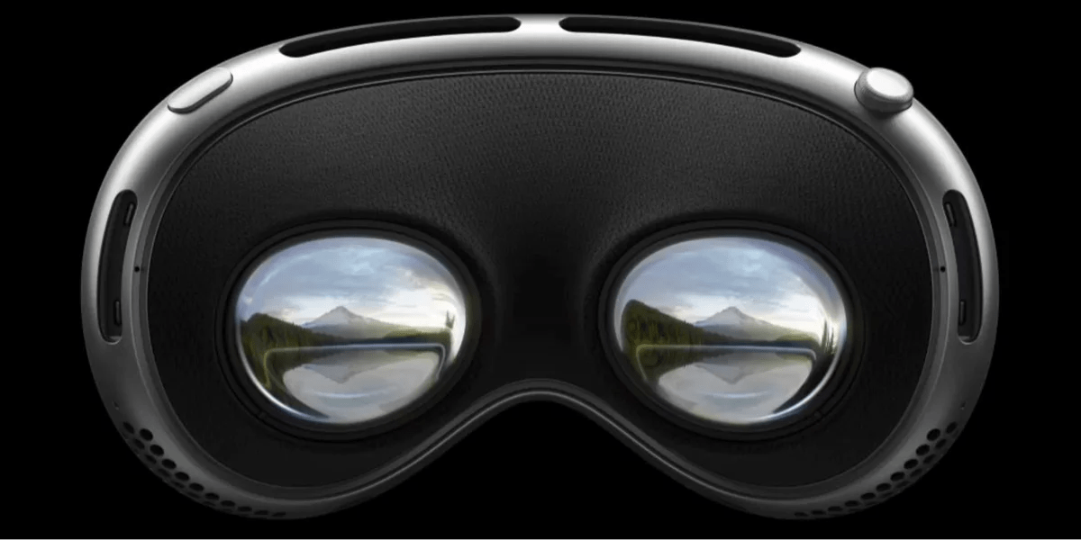
Apple conveniently provides the six component images on their Vision Pro page. You can borrow them (for learning purposes or with permission). Each image has transparency, making layering possible. Save them as PNGs and note their dimensions. To avoid layout shifts, consider using background-image with background-size: contain and background-position: bottom center, which is how Apple structures them for responsiveness. Alternatively, use img tags with object-fit: contain. The key is to maintain the correct aspect ratio as the viewport changes.
3. Set Up the Base Structure
Create a container div that spans the full viewport height and holds the images. Use position: fixed to keep the layer stack at the bottom of the page during scrolling. Inside, place each component as a div with the image as a background. To simulate depth, use z-index: the outermost layer (sub roll) gets the highest and lowest values, the middle layer (bun) gets middle values, and the innermost (bread stick) gets intermediate ones. This creates the “front and behind” illusion. But fixing elements this way breaks scrolling—the device can’t scroll into or out of view.
4. Make It Responsive and Scroll-Friendly
To fix the scrolling issue, don’t use position: fixed on the parent. Instead, let the container sit in the normal document flow, but position the images relative to the bottom of the viewport using a combination of position: sticky and bottom: 0. Alternatively, emulate Apple’s approach: apply the images as background-image on a full-height section with background-attachment: fixed and background-position: bottom center. Use background-size: contain to ensure they scale without clipping. For the responsive behavior, wrap everything in a container with aspect-ratio: 1 or use clamp() for sizing. Test at different widths—the animation should stay centered and visible.
5. Animate the “Exploding” Hardware with CSS
Now for the scroll-driven animation. Use the newer animation-timeline: scroll() and @keyframes to make each component rise sequentially. Define keyframes for each layer: start at translateY(100%) (off-screen below) and end at translateY(0). Stagger the start times using animation-delay within the scroll timeline (e.g., layer 1 delays 0s, layer 2 delays 0.2s, layer 3 delays 0.4s). Since CSS scroll timelines activate based on the element’s position in the viewport, attach the animation to the container. To make it look like the components “explode” out of the device, add a slight scale-up effect and use opacity from 0 to 1. The transparent images will create the illusion of depth.
6. Simulate the Flip-Up to Eyepieces
Apple uses a video for the flip-up, but we can replicate it with a sequence of static images and CSS 3D transforms. Create a sprite sheet of the flip frames, or use a series of images. Place them inside a div with perspective: 1000px. Then animate the rotation of the entire device container using transform: rotateX() along with translateY() to keep it centered. Keyframes: from 0deg (flat) to 90deg (showing eyepieces). Use animation-timeline: scroll() and adjust the scroll range so the flip triggers after the explosion completes. If you’re using multiple images, fade between them with opacity and z-index to create a smooth flip. This approach is simpler than a video and purely CSS.
7. Test, Polish, and Handle Edge Cases
Finally, test across Chrome, Safari, and Edge (Firefox lacks support for animation-timeline: scroll()). Use @supports (animation-timeline: scroll()) to provide a fallback—perhaps a static image or a JavaScript version. Check that all elements scale and remain centered. Adjust the scroll range values with scroll-timeline if needed. Add smooth transitions for opacity and transform to avoid jumps. Remember to include will-change for performance. After polishing, you’ll have a fully responsive, CSS-only recreation of Apple’s stunning Vision Pro animation.
Recreating complex animations with pure CSS is both a challenge and a delight. By breaking down the original, leveraging modern scroll-driven features, and carefully managing layers, you can achieve impressive results without a single line of JavaScript. So go ahead—inspect, experiment, and push the boundaries of what stylesheets can do.
Related Articles
- How to Optimize Diff Line Performance for Large Pull Requests
- CSS Native Randomness: A Game-Changer for Dynamic Web Design
- How to Create 3D Rotations with CSS rotateY()
- Vue Component Testing Now Possible Entirely in Browser – No Node.js Required
- Embracing Unpredictability: How Native CSS Randomness Transforms Web Design
- Smart Cache-Busting for JSON and Static Assets Using PHP’s filemtime()
- 6 Ways Native CSS Randomness Transforms Web Design
- Discovering Beautiful CSS Color Palettes Beyond Tailwind